Website History
Previously, they were using a Front Page-like process, so they had full control of the design. It had served them very well over the years, but they had realized the business outgrew the site’s functionality.
Goals
Standard Distributing’s Goals
- Create a seamless user experience for current customers to log into the ordering system.
- Ability to add promotions to website.
- Update site design to reflect new branding.
Hoverboard’s Goals
- Give Standard a CMS to update the website while keeping in place the overall design aesthetic.
- New design to be responsive to prolong the investment of the new site.
- Keep front-end code as lightweight as possible.
- Streamline current email campaign process.
Design

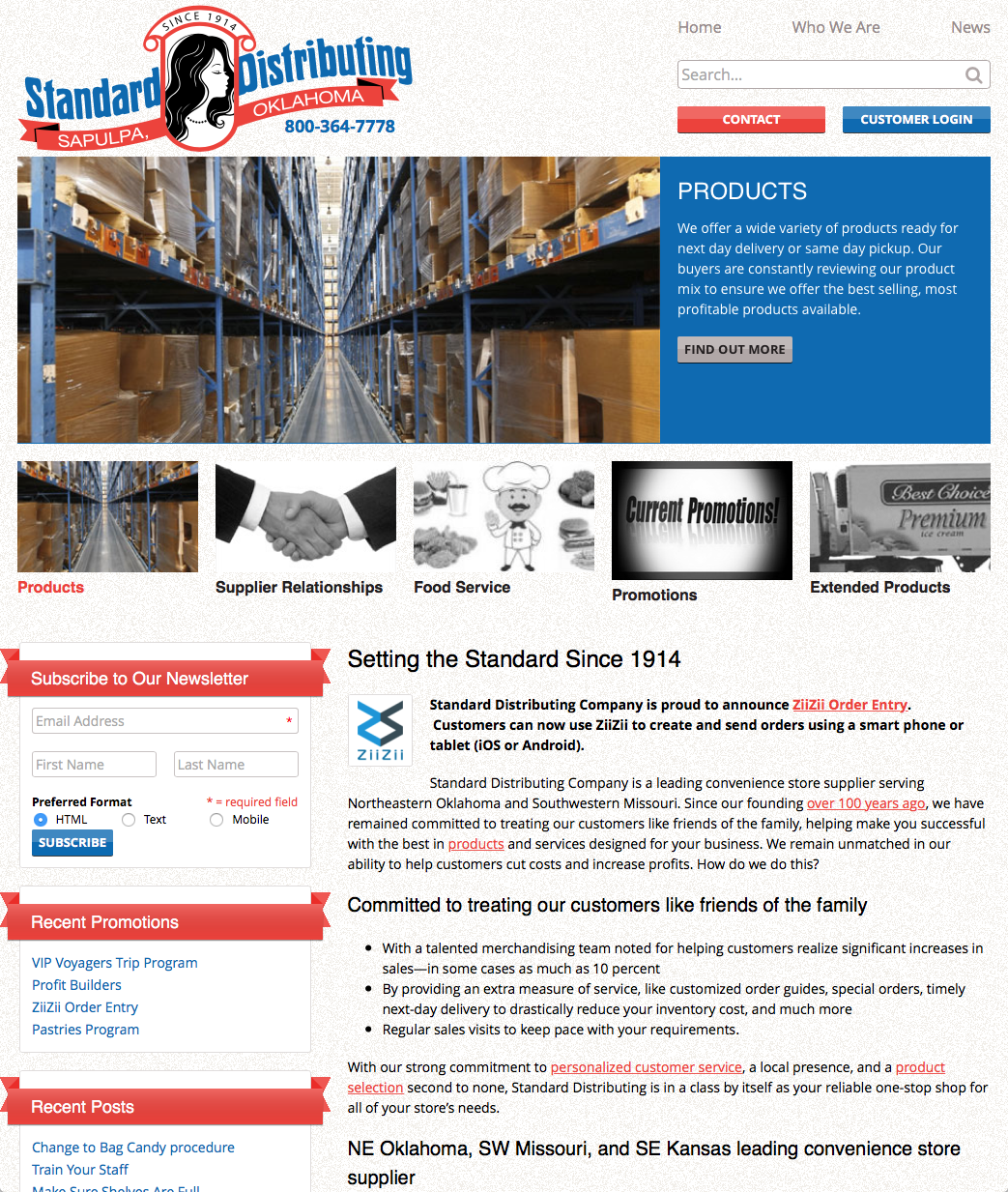
The overall look and feel was based off the supplied branding, using the same color palette and ribbon treatment for headings on the site. There wasn’t an equivalent typeface to the branding type so we used “Oswald”, a similar web font in the Google Fonts Library.
After the discovery process, we concluded there were two different user stories:
- As a potential customer, I am gathering information about Standard Distributing. I would either fill out the contact form or call the phone number to get in touch.
- As a current customer, I am looking at current promotions or logging into the backend system to place an order.
Because of these user stories, we made the “Customer Login”, “Contact” buttons and the (clickable) phone number prominent in the header.
Front-End Code
The website is built responsively with a mobile-first approach. Per our goals from above, we kept the front-end as lightweight as possible, using SVG’s and CSS whenever possible.
Inuit.css was used as a lightweight css framework using BEM naming conventions to keep everything as modular as possible.
The underline animation on the header navigation ended up being very successful in the community.
0
WordPress
![]() To keep the site as editable as possible, we utilized custom menus, widgets and the Theme Customizer as much as possible when integrating the design. That being said, we also limited customizability so that the design couldn’t be compromised with these options.
To keep the site as editable as possible, we utilized custom menus, widgets and the Theme Customizer as much as possible when integrating the design. That being said, we also limited customizability so that the design couldn’t be compromised with these options.
Newsletter Process
 On their old site, they had a way of sending out emails to clients, but had fallen behind on it due to the cumbersome process. To help the process out, we setup a MailChimp account that scrapes the RSS feed of the “News” section of the site. This creates a “write once” content approach and makes the content accessible on the website and search engines.